Concept project | Solo | 2 weeks
UX researcher & UI designer

Enhancing the Online Shopping Experience for a Local Toy Store
Design Process:
A ‘Double Diamond’ approach
Research, user interviews, affinity mapping, card sorting, competitive and comparative analysis, low mid & hi-fidelity design, UI design, prototyping, usability testing.

Tools used:
Figma
Slack

Zoom
Brief
Whimsical Wonders, a local children Toy shop, has plenty of website visitors yet few completed purchases.They are looking for a way to increase the number of completed purchases.
Problem
A year ago, Whimsical Wonders saw an opportunity to support the local community by allowing people to order some products online. The website had been attracting plenty of visitors, yet few completed purchases.
Solution
By updating their e-commerce website, they aim to increase completed purchases.
Process
4
User
interviews
5
Usability
test
4
Competitors
4
Card sorts
Discover
User Interview
To start the discovery phase, I conducted 4 interviews to explore user experiences with online and in-store shopping, with a specific focus on toy shopping.The goal was:
By summarizing the common trends and findings from these interviews I created an affinity map.
1. To understand their preferences and motivations for online shopping
2. To find out why users visit a website but abandon their purchases
3. To identify what makes an online shopping experience satisfying for users

I found 5 key insights:
“I love it when the checkout is quick and straightforward. It makes my life easier"
"For me, transparency during checkout is a must. I want to know what I'm paying for"
Users prefer a quick and transparent checkout
Users prefer access to detailed product information
“I rely on detailed product info to make informed decisions"
"For me, having access to comprehensive product info is a must. It builds trust."
Users like to use filters to expedite their search
"When I'm shopping online, I always use filters to narrow down my options quickly. It saves time."
"I find it convenient to use filters because they help me find what I want without scrolling endlessly."
Reviews can influence users' choices
"When I'm deciding on a purchase, I always check reviews. They give me confidence in my choice."
"I rely on reviews to get a sense of what others have experienced with a product. It's a crucial factor in my decision-making."
Efficient customer service encourages online shopping
"Efficient customer service makes online shopping a breeze and keeps me coming back for more"
"Fast customer service = more online shopping."
Competitive and Comparative Research
To get an understanding on what other brands were doing, I did competitive and comparative research.


I found three key takeaways from this analysis:
-
Offering a guest checkout option significantly streamlined the purchase process, cutting the required steps by more than half.
-
All of these sites would offer a fast delivery option.
-
Splitting payment, shipment address, and reviewing items into separate pages can add unnecessary steps, potentially leading to user frustration.
Define
Persona
In the define phase, I translated my research findings into a user persona. She represents the needs, goals, and expectations of a significant user segment, guiding us in crafting a product that resonates with their requirements– Meet Betty, a busy mum located in London that loves spending time with her children.

Problem Statement
Reflecting on my persona I came up with the problem statement:
‘Betty needs a user-friendly online toy shop offering a wide variety of toys with accurate descriptions and a streamlined checkout process, enabling her to quickly buy toys for her children and spend more quality time with them‘
How Might We Statement?
‘How might we simplify Betty's experience in navigating and selecting toys from a vast product range, ensuring she can confidently trust the accuracy of product descriptions and images while shopping for toys online?’
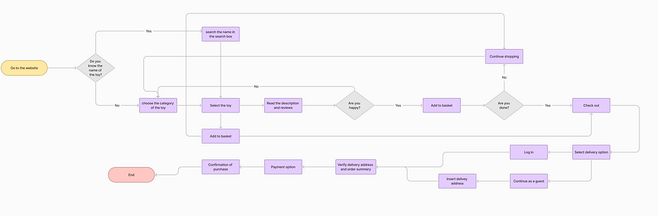
User Flow
Then I created a user flow illustrating the steps users take after selecting an item to successfully finalise the checkout.
Develop
Information Architecture & Card sorting
With insights from my research and analysis, I transitioned into the development phase of the project. To prioritize clear site navigation, I initiated card sorting as the first step in site development.
I conducted an open card sorting exercise with 4 users to have them categorise products according to their preferences, aiming to identify trends and common categories. This process uncovered common themes within 6 categories, which were then used to inform the information architecture and navigation.

Design Studio
I began sketching my ideas on paper to plan the design layout. Based on my interviews and research I knew that easy-to-understand navigation and a streamlined checkout was essential for the design.

Mid-fidelity Wireframes
Following the sketching phase, I jumped into Figma to create my mid-fidelity wireframes. After completing the wireframes, I conducted 5 remote usability tests via Zoom. The task was:
To find and purchase a scooter for a 2-year-old child while also gathering feedback on the site's checkout flow.
User Testing Results
100% of users could finish the task and all felt navigation & checkout was clear and simple.
Landing page
Users liked having clear & multiple delivery option
A ‘Favorite’ menu was missing here

Users liked the clear product layout
Checkout page
Users liked the option to filter the product
Filtered page


Users would like to have more payment options
Users would like to have the ‘Click & Collect’ option

Users would like to see the ‘ Return Home’ button
100% liked the confirmation message
Users liked having different steps of checkout in only one page
Confirmation page
Users liked ‘Express checkout’ option
Product details page

Users liked having different images of the product
Users liked having access to product’s detail
Users liked having access to ratings and reviews
Colour & Typography
I then moved on to making my hi-fidelity wireframes, thinking about the colour and typography I wanted to use. I strategically chose green to convey a sense of nature and vitality while providing a calming effect. Gray was employed for its neutrality, sophistication, and ability to enhance product visibility, with very light grey creating spaciousness and improving readability. These colours collectively foster a harmonious and welcoming online shopping experience for both children and parents.
Using a handwritten type style for typography can create an honest, friendly, and down-to-earth atmosphere. I chose Comic Sans MS to add a sense of approachability and childlike playfulness to the design.

Deliver
Let's use those research and user testing, along with my chosen colour palette and typography.
To present the final product: a user-friendly desktop prototype for 'Whimsical Wonders' toy shop.
Revising the issue:
Problem statement
Betty needs a user-friendly online toy shop offering a wide variety of toys with accurate descriptions and a streamlined checkout process, enabling her to quickly buy toys for her children and spend more quality time with them.
High-Fidelity Prototype
Solutions
To address the problem and increase completed purchases, I designed a user-friendly website for 'Whimsical Wonders' toy shop by including features like:
-
Easy navigation based on card sorting.
-
Transparent delivery costs.
-
A clean and inviting homepage showcasing new, on-sale items, popular products, and brands.
-
A quick 'Checkout as Guest' option.
-
Detailed product pages with reviews.
-
Filterable search results.
-
An intuitive checkout process with various payment choices.
Next Steps
-
More usability testing:
I will continue usability testing on the high-fidelity prototype to collect user feedback and identify any usability issues or design improvements.
-
More accessibility testing:
I will conduct accessibility testing to ensure that the website is usable by individuals with disabilities and make any necessary adjustments to meet accessibility standards.
Key Learnings
-
This project was my first time doing a card sort.
I found it really interesting to understand how users perceive and categorise information. It highlighted the importance of user- centred design and iterative improvements. Overall, it was a valuable experience in enhancing product usability and organisation.
-
Transitioning from the Mid-Fi to Hi-Fi version was challenging,
I didn't have a clear roadmap, and I wasn't sure how to translate the conceptual designs into a polished, functional product. It was a steep learning curve, but it deepened my design and technical skills.


